With remote working presenting new challenges to our creative process and our production team wanting to experiment with new design features, we’ve recently switched to a new design tool. But which option would work best for you?
In 2016, Figma introduced an innovative browser-based interface design tool. The same year, Adobe Inc. released its own version of a UX design tool: Adobe XD.
Alongside other popular editing software options such as Sketch, both Adobe XD and Figma have evolved into competitive design platforms, and our production team decided to investigate the pros and cons of each. Here’s what we found:
Platform and performance
The most obvious difference between the two platforms is that Figma is browser-based, whereas Adobe XD is a downloadable desktop application.
Adobe XD allows users to work with local files offline. It also allows users to share and get feedback on their design, thanks to its cloud capabilities. In its recent update, Adobe took a step further and XD now integrates with apps and services across the Creative Cloud suite. This means that sharing assets between apps and users with Creative Cloud Libraries is now easier.
Some might assume that Figma’s browser-based approach to designing is limited to internet connectivity. However, Figma allows its users to work offline on a pre-opened file via a desktop app (available for both Mac and Windows).
When comparing the two, it all comes down to individual preference and work style. However, working on a browser-based platform like Figma definitely has some advantages when it comes to collaborative work and live updates.
Pricing
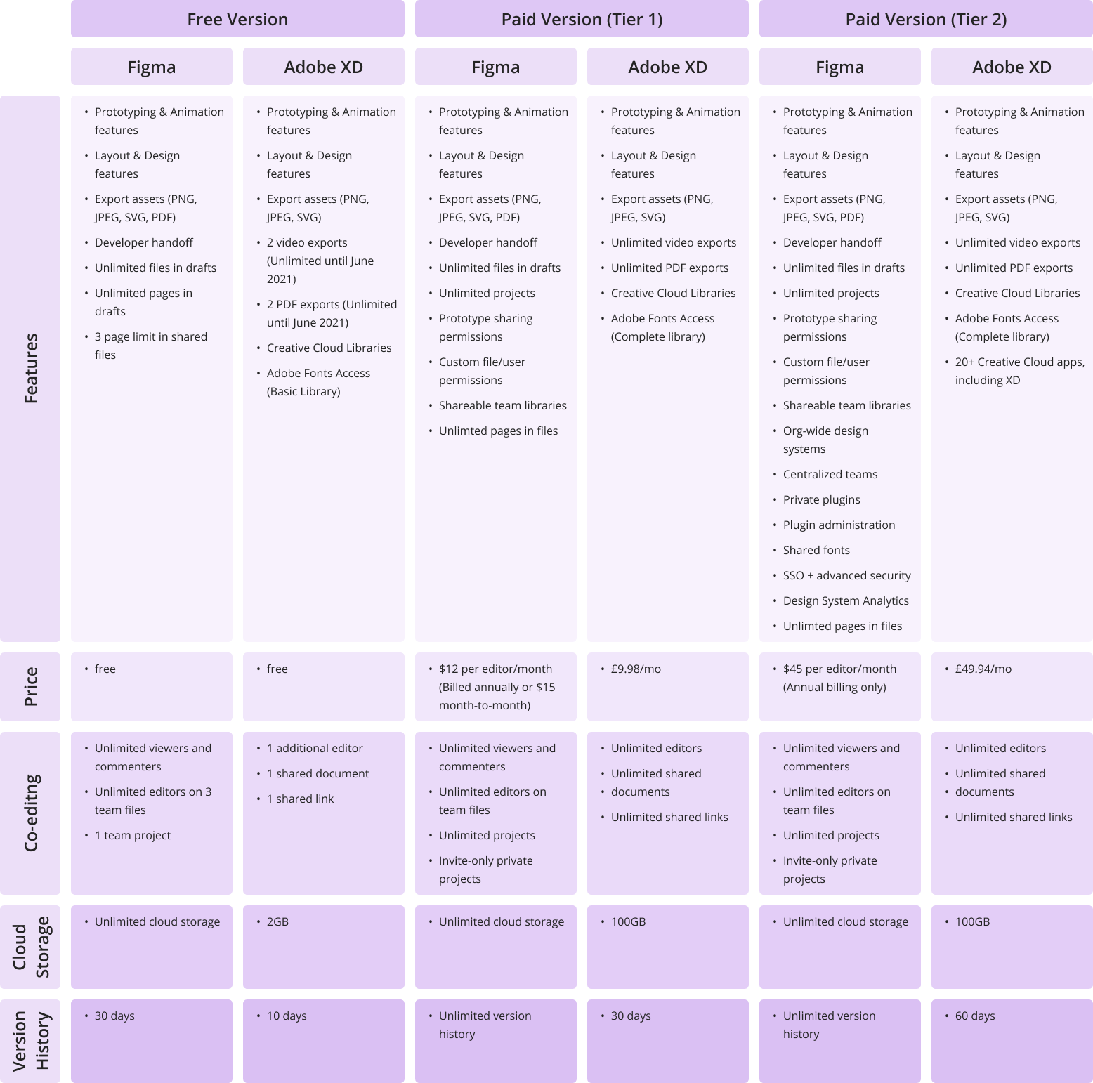
Both Figma and Adobe XD offer free and subscription-based pricing options. XD’s single-app plan for professionals and small teams costs £9.98 per month (without a trial) and is free for personal use. Figma’s pricing options break down as follows: free for personal use; $12 per editor/month on the Professional Plan; and $45 per editor/month on the Organization Plan (annual billing only).
It’s worth mentioning that Figma’s free version allows unlimited editors on 1 project and 3 team files, as well as a 30-day version history, unlimited cloud storage, and unlimited viewers. Adobe’s free starter plan only allows for collaboration on one shared document and one additional editor, limited cloud storage (2GB), and a 10-day version history.
Here a more detailed view on the price differences between the two:
Features and functionality
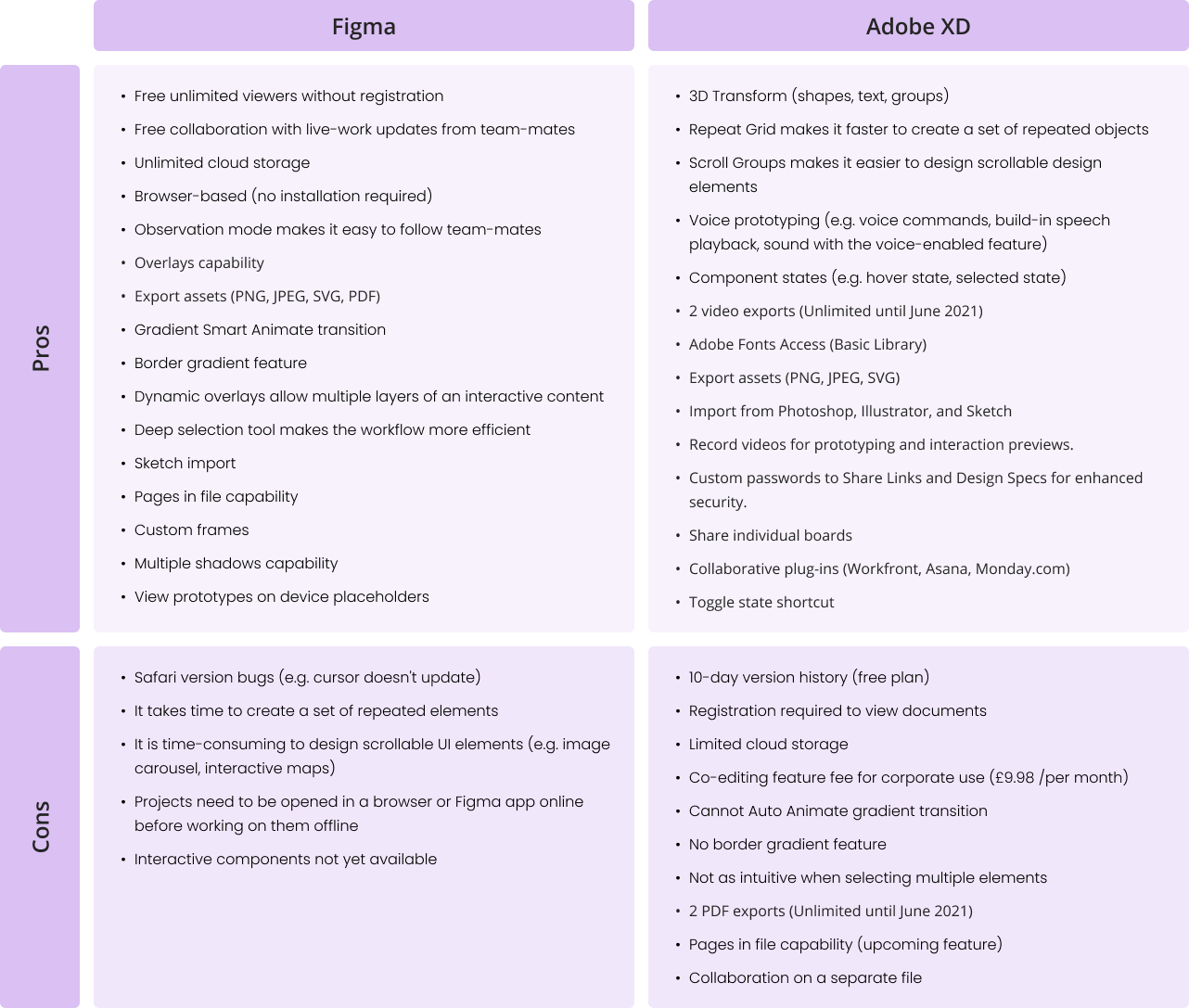
Figma and Adobe XD are becoming more similar in terms of features and functionality. Each platform seems to adopt something new with every update. For example, Adobe XD has been working hard to achieve something similar to Figma’s game-changing collaboration features. On the other hand, Figma only recently introduced its Smart Animate feature, which is very similar to the Auto Animate feature that Adobe XD introduced some time ago and changed the prototyping experience completely. However, there are still some visible differences in workflow. Let’s discover them below:
What are we using at Verve Search?
At Verve Search, we’ve chosen Figma over other prototyping design options.
Here are the five reasons we decided to go with Figma:
1. Figma is free
Team accounts are paid but individual accounts are free and include all the same key features as the paid version.
2. Simpler developer handoff
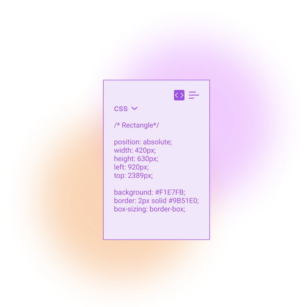
Our developers can get dimensions, styles, and download icons and images from the project URL. Resources such as images and SVGs can be exported globally and locally.
3. Easy collaboration
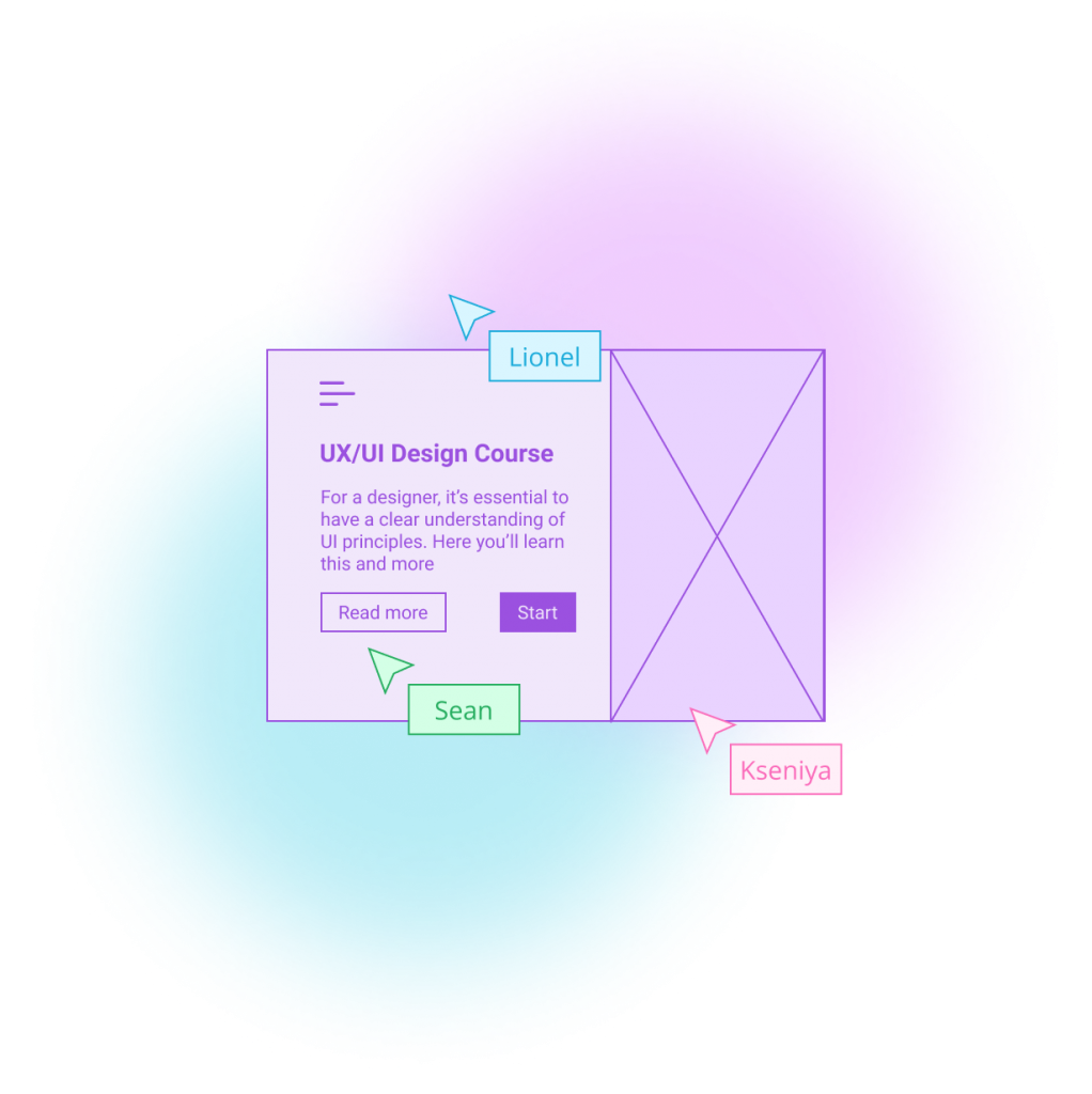
Co-designing alongside your co-workers is no longer a fantasy. Our team can now edit files together in real-time, leave comments with mentions, and follow along via Observation Mode. This has been particularly useful for remote working.
4. All-in-one platform
It’s an all-in-one platform that does not require switching from one system to another in order to complete or share the design process. Designing, prototyping, reviewing work, and sharing feedback are all in one place.
5. Design features
Tools like ‘deep selection’ provide more control over design elements and save time during editing. Other features that our team enjoy working with are instant arcs, overlays, gradient borders, smart animate gradient transitions, and much more. Figma helps our designers to expand their creative ideas and showcase their visions throughout the design process.

Final thoughts
Figma made the right choice to focus on collaborative work and the ability to access files from the browser without installation, while I find that XD’s strength is in finding new design processes, such as Scroll Groups, 3D Transform, and Repeat-Grid features.
Only time will tell which platform will gain more recognition among designers. So far, Figma and Adobe are doing well at listening to user feedback and transforming it into real features, bringing visual design onto another level.
Features and images presented in this article are extracted from the official websites of Figma and Adobe. Figures for both are correct as of May 2021.
Interested in our content marketing and digital PR services? Get in touch.


