Why your content needs expert collaborators (and where to find them)
Producing newsworthy content for our clients means communicating a level of authority between industries that we (quite often) have no first-hand experience of working in and journalists who have years of experience covering sectors that our clients sit within.
Often, we can rely on client spokespeople to provide comments for the press and which analyse the work we produce. But content that is built to earn links can also cover topics and conversations that stretch beyond a client’s product while still remaining relevant for them to talk about, which means we often look further afield to find people who can offer valuable perspectives on our stories, or help us construct our content from the very beginning.
In my time at Verve Search, I’ve been lucky enough to work with world-renowned scientists and academics, artists, authors, photographers, gamers, and experts on more subjects than you can shake a stick at. All of these individuals and organisations have taken our stories from being a collection of interesting statistics or attractive pieces of content to something more newsworthy, which is brought to life by the authority behind their words.
How we work with collaborators depends largely on which gaps of authority exist within the production and PR strategy of each piece of content. Here are just some examples of how we’ve worked with expert collaborators in the past:
We’ve partnered with world-renowned academics and specialists to plan and execute our campaigns, like we did here with Harvard University for Babylon Health
We’ve tapped into the unique resources of subject specialists to create in-depth campaigns with data that is normally unavailable to the public. We worked with Ian Shirley (editor of Record Collector magazine’s ‘Rare Record Price Guide‘) to put together reams of imagery and information not found elsewhere about hugely valuable vinyl records
We’ve received valuable commentary from industry experts on our survey results and independent research. For Influencer Investors, our Paxful campaign about stock market guidance on TikTok, we asked financial planner and psychologist Dr. Brad Klontz for his expert analysis of our findings and created a valuable Q&A asset
The Outreach case for finding collaborators
One key indicator to any campaign’s success is how many high-quality and authoritative links it generates, and it should almost go without saying that journalists will appreciate a story being sent their way that is supported by reliable and authoritative experts within a relevant field. I spoke to Tonje, one of Verve Search’s super-talented Outreach Specialists, to ask about why the team finds it useful to lean on the expertise of external sources…
Q&A with Tonje Odegard, Outreach Specialist
Why is outreaching more successful when there’s an externally-sourced expert attached to the story?
First of all, in addition to a credible data source, journalists always need quotes in order to complete a classic news story or feature. If we can provide these from a relevant and credible expert or collaborator, it will save the journalist having to source these from elsewhere, increasing our chances of them using our content (and ultimately linking). Alongside having graphs and illustrations from the campaign, we’re essentially providing a one-stop shop for the journalist.
Secondly, having expert commentary or quotes adds substance, credibility and gravity to the pitch, which again increases the chances of it being covered. For instance, when working with Babylon Health, we used expert commentary from the doctors there on several occasions in our campaigns and outreach. Overall, we secured links in high-punching publications such as The Telegraph, City AM, Time Out, Metro, New York Post, Houston Chronicle, Forbes, and Cosmopolitan as a result.
The top-tier coverage we received featured guidance from a client spokesperson.
What kind of things do you think journalists are interested in when it comes to experts and collaborators?
The clue is in the name; the purpose of experts and collaborators for journalists is exactly that – to provide their expertise on the subject the journalist is covering. They are an essential part of any news story or feature as it helps break up the article into a more digestible format for the reader as well as offer credibility. In essence, experts help explain the topic covered in a story.
Are expert Q&As useful to have on hand?
Q&As are a formidable way to convey information in a conversational tone that is easy for the journalist to turn into quotes – if they’re feeling really lazy, they can even copy and paste it entirely. But having the expert ready at hand to answer any additional follow-up questions is also key as many journalists want something unique or more specific to use in their article.
Do you think journalists find campaigns more reliable when they are backed up with an externalexpert’s data and imagery rather than completely in-houseassets?
Yes, I definitely believe so. Having an expert involved who is willing to endorse the campaign’s message demonstrates to the journalist that this is a legitimate and reliable source of information. If the expert comes from the client we are representing, there is a danger that the pitch can appear too commercial, but this will usually not be the case if the expert is relevant and credible – so always make sure they are. Using an external expert can often add more credibility.
How important is it to journalists that a field expert provides commentary and context on independent research findings?
As mentioned above, it helps cement the credibility of the data and message of the campaign. Any good journalist would seek to back up claims made in their article and as such, they would try to hunt down a relevant person to comment on the findings. If we can present this person at the same time as pitching them the research, both us and the journalist have killed two birds in one stone.
So, where should you begin?
Identify your needs
There are different ways you can incorporate an outside expert in your campaign. At what point they enter the production process depends on how best you think they’ll be able to contribute to the project. In my time at Verve, our collaborator partnerships have usually fallen into one of the following categories:
They comment on our in-house study. This means we’ve sourced our own data and broken it down into key findings. We may have run a study and come to some interesting conclusions, or collected a huge variety of new information via freedom of information requests. Either way, we’re looking for an authority on whatever the subject may be to give us some all-important context to what we’ve found out. We want them to answer some burning questions that have arisen because of surprising or even predictable discoveries we’ve made – answers that journalists love to feature and readers instantly trust. Ask yourself whether you need someone to answer your burning questions.
They advise us on a methodology and provide commentary where necessary. Sometimes we need collaborators to help shape the building blocks of our campaign. It means we have the story in our mind, but we need specialist guidance on how to execute something that needs an expert eye. We ran a campaign called Understanding Dementia and knew that the subject needed an official figure on dementia to ensure our campaign handled the subject with the sensitivity and authority it deserved. We worked with a leading dementia expert to give us her vision for how our planned games and puzzles could successfully emulate the confusion and frustration associated with the condition. We’ve also worked in this capacity with world-renowned academics and specialists who’ve advised on our campaigns at early junctions, like planning survey questions, helping shape extra angles to our research. Ask yourself whether you need expert guidance to build your project.
We incorporated our expert’s comments into the Understanding Dementia puzzle game to create a narrative that puts the user’s experience into context.
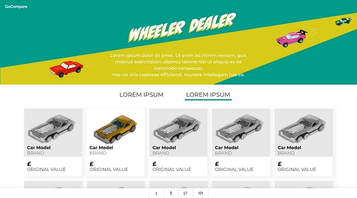
They lend us resources that are otherwise not openly accessible. Some campaigns rely on the knowledge and resources of industry professionals. We’ve worked with all sorts of individuals and companies over the years that have given us their time and expertise to help create a more valuable piece of content for the news landscape. For example, Wheeler Dealer for GoCompare saw us partner up with an expert on vintage toy cars who gave us lots of specialist data and imagery…
Wheeler Dealer used the data and imagery provided by an expert on vintage toy cars.
…and we tasked the talented 3D-modelling artists at 3DLines with creating fantastic photorealistic mock-ups of familiar TV and movie rooms remade for the modern-day. Ask yourself whether your campaign needs the unique resources of an interesting individual or company.
But where can you find the right expert?
Where to find an expert
Use free find-an-expert search engines
Some of the best universities in the world have find-an-expert indices that list the academics and experts open to helping out the media. Here are some key ones:
You can usually search by field of study to help you track down the best person for your needs. If you’re going down the academic route, you should also try googling scientific studies and research institutions relevant to your subject to discover their authors. Why not try reaching out to them? We went to Professor Daniel Russell, a leading loneliness expert who developed the globally recognised UCLA Loneliness Scale, for guidance on our loneliness project with former client Echo.
Use social media
One of the best resources for widening your network is Twitter. Search out highly followed and influential people on the subject you’re working on. We contacted Matt Huxley, an esports lecturer at Staffordshire University, through Twitter, and he agreed to help us out with our project Esports Elites for Casumo. Matt had a large social media following and was used to being featured in the media, so we knew he was a fantastic authority to comment on our findings.
Find a book
Don’t worry, you won’t need a library card for this one! We’ve found expert collaborators by searching for books around our subject of interest. If you can track down and contact the authors or researchers (perhaps through their personal websites, social media, or publishers), you might just find that they’ll be really enthusiastic about your project.
In the past, Amazon has proved to be a useful resource for finding the right books. We used this method to find an expert to help us answer some questions for our project Crep Check for Farfetch. Crep Check is a database of the most valuable trainers in the world, and we included rankings for the shoes that have appreciated the most in value from their original retail price. We knew that finding a top sneaker expert and having them answer some questions would give journalists an extra angle to feature, so we searched online for experts and found one in the form of Mathieu le Maux, author of ‘1000 Sneakers: A Guide to the World’s Greatest Kicks, from Sport to Street’.
We sent Mathieu a message over Twitter and it didn’t take long for him to get back to us. The result? GQ magazine and the Daily Mail featured some of his comments prominently:
We used this method again to search for a reputable source of data, high-quality imagery, and expert commentary for Record Value, our project with Australian life insurance company NobleOak. Our answer came in the form of Ian Shirley, editor of ‘The Rare Record Price Guide’. Ian was the perfect fit for our campaign and gave us plenty of resources to work with as well as giving us valuable information about each of the 75 records in the final campaign.
Find a charity
We’ve partnered with lots of charities over the years and the benefits of attaching the campaign to the name of a reputable and established charity are numerous.
With Understanding Dementia, our Babylon Health campaign that attempted to reflect the effects of dementia with a series of frustrating games and puzzles, we partnered with Professor June Andrews, a renowned dementia expert to help us out.
June provided guidance on what effects we could attempt to reflect with our games, plus commentary on our games to help the user understand what aspects of dementia they were experiencing.
We partnered with two mental health charities for another project with Babylon Health called Student Stress. Both charities appealed in person and on their Twitter and social media accounts for students to tell us what stress felt like in their own words. We received lots of evocative descriptions of mental health from students all around the world, and our talented designers went to work illustrating them.
Keep up with the news
We’ve secured collaborators in the past by reaching out to them as a result of seeing their work in the news. It’s a surefire way to find names that are trusted by journalists as an authority on a subject.
And finally…
When should you budget for expert collaborators?
It’s always worth keeping a budget in mind if you expect to ask a collaborator to do a large amount of work for you.
Before you reach out to someone, ask yourself:
How much of their time are we asking them to take up?
Are they just doing their day job, but for us? If so, they’ll expect to be paid.
Is this specific expert absolutely vital to the story earning coverage? If they require a fee, it’s worth thinking about putting aside some of your budget to cover it.
Sometimes, budgets will be tight. In many cases, you’ll be able to get a collaborator on board for free just by outlining the (credited) coverage they themselves will receive by taking part in your project. For a lot of people, this is sometimes compensation enough for being involved, especially if we know we’re presenting them with fascinating new insights around their specialist topic.
Keep your communication respectful of your collaborator’s energy and time and you’ll be able to build a creative partnership that will always be useful to have on hand.
Further reading:
How to enhance your Digital PR outreach with expert quotes [1]
20 examples of great quotes for your press release [2]
Interested in our content marketing and digital PR services? Get in touch.
6 UI design principles you need to know
For a designer, it’s essential to have a clear understanding of UI principles. UI principles are high-level concepts that serve as guidance when designing a user interface, which is the point at which human-computer interaction occurs. The hierarchy in the UI design is fundamental in determining what the user will take away from their experience when using the interface.
The goal of a UI designer is to anticipate what a user might need to do by producing an interface that naturally encourages exploration and avoids confusion.
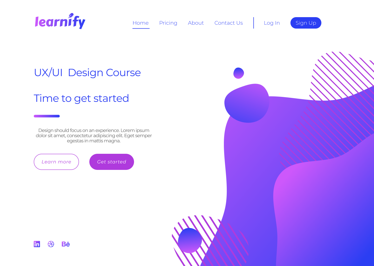
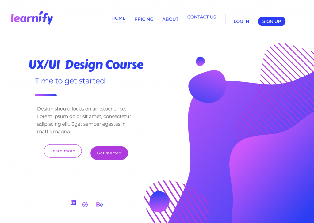
For this post, I’ve designed a simple landing page for a fictional learning platform. This landing page design – that in its current state follows all of the UI principles correctly – will be used as a point of reference to demonstrate six key design principles.
I’ve accompanied each section in this blog with a version of the above page that demonstrates how a bad design decision could affect the overall image and the usability of your design.
So, let’s get started…
Typography
Typography is one of the most important principles in user interface design. It’s the technique of arranging text to make it readable and visually appealing. The arrangement of the text includes selecting typefaces, font sizes, line lengths, line-spacing, and letter-spacing, and adjusting the space between pairs of letters.
Good design doesn’t need to feature lots of different typefaces. Unless the typography is a core design element, you simply don’t need to use lots of typefaces to convey a message.
More often than not, simplicity is key, and a strong design might only feature one or two typefaces. The typography principle is there to lead the reader’s eye to the right place at the right moment. It sets the tone of your page and helps to establish a visual hierarchy in your design.
For example, a larger font size and bolder font-weight have a higher chance of being seen by the user, but if we were to compare…
this lightweight text in a bigger font
with
this bolder text in a smaller font
…the chances are the first example would stand out more.
One way to improve a website’s readability is to increase leading (or line-height, in other words). This spacing between the two lines of text has a key impact on legibility; correct line-height helps the reader’s eyes travel from one line to another.
Although the standard leading is 120% the point size of the font, the leading can be set to automatic adjustment and can be modified according to the typeface needs. The body text in the example below illustrates poor use of leading.
The text is clustered which makes it difficult to read. Overall, this page does not give its viewers a sense of flow when reading the material from start to finish. The various alignments and improper use of fonts does not convey a story, nor does it urge users to take an action.
Tip
Select typeface for the headers only after you are confident with a typeface for the body text.
Scale
Scale in design refers to the sizing and the proportion of the elements on a page. Every element, whether a piece of text, a shape, or a line, has a weight.
The weight is created from the size, colour, or texture of an object. A symmetrical, well-balanced design is formed by aligning equally weighted elements on either side of the centre line. With the scale principle in mind, the designer needs to make sure that the page doesn’t look either overcrowded or empty.
One way to achieve this is with the use of padding and white space, or by simply adjusting the scale of an element. Scale can be used to direct viewers’ attention from the most to least important elements.
Objects of a bigger scale tend to attract viewers’ attention more, so the scale principle can be used as a way to rank design elements and influence the order in which users view them.
Below is an example of badly scaled design. The scale principle should help in guiding the users through their experience, but on the page below, the viewer can’t focus on any of the elements. The header is too big, the action buttons are too small, and the social media links (already highlighted enough with colour) are unnecessarily large.
Tip
It’s good practice to apply the golden ratio in your design. The golden ratio can be applied to spacing, composition, and layout; try using a golden ratio template. Plugins such as Font Scale can help establish a typography foundation.
Alignment
Alignment is the arrangement of elements in a straight line or correct relative order and is recognised as one of the core UI principles. Any two connected points are referred to as a line.
When executed correctly, alignment creates a hierarchy within a design and helps direct the user’s attention towards specific information. Arranged content is easier for the user to scan through which increases readability and the viewer’s engagement.
Alignment can be achieved with a clearly defined boundary or a division. A defined boundary can be perceived in a group of elements that share a common area. When the elements are close or proximate to each other they tend to be visually grouped.
In the example below, an excess of misaligned elements strips the viewer of a clear visual path. It’s now unclear where the viewer should start and finish navigating the page.
As the human eye naturally seeks perfection, an intentional misalignment of an object could sometimes be used as a way to attract a user’s attention. One way to do so could be by increasing the y-axis of a navigation bar link of a selected page as a way to highlight the user’s current location on a site.
Tip
Enable a predefined grid or customise one to make sure elements are aligned and visually organised.
White space
For a design to work, it needs to have an adequate amount of space between its objects. In our example below, the area around each object is white space, which also happens to be the negative space and another key UI principle.
Unlike positive space, which is the area of interest on a page, negative space is the background area around the subject of interest. The right amount of white space can simplify and break a design into chunks of information that are easier to comprehend.
A larger white space around the text helps improve readability. A design that has a very minimal use of white space could overwhelm the reader’s eye.
In the example above, it’s obvious that the design lacks white space, making it heavy on the eyes.
Here are a few reasons why this is happening. First, although the CTA buttons are emphasised with boxes, the text inside of them lacks padding and subsequently looks too big. The visuals on the right side of the page are too large and too close to the top navigation bar and the text on the left side of the page.
Elements on the left-hand side don’t have enough space to breathe and are overwhelmed by the size of the visual element. Header one and header two seem to be too far apart – despite them being part of the same group, they seem isolated from one another. The same issue can be seen with the CTA buttons, which once again are too far apart.
Tip
Button borders usually work well when the padding ratio is 1:3 for the top and bottom, and 3:3 for the right and left.
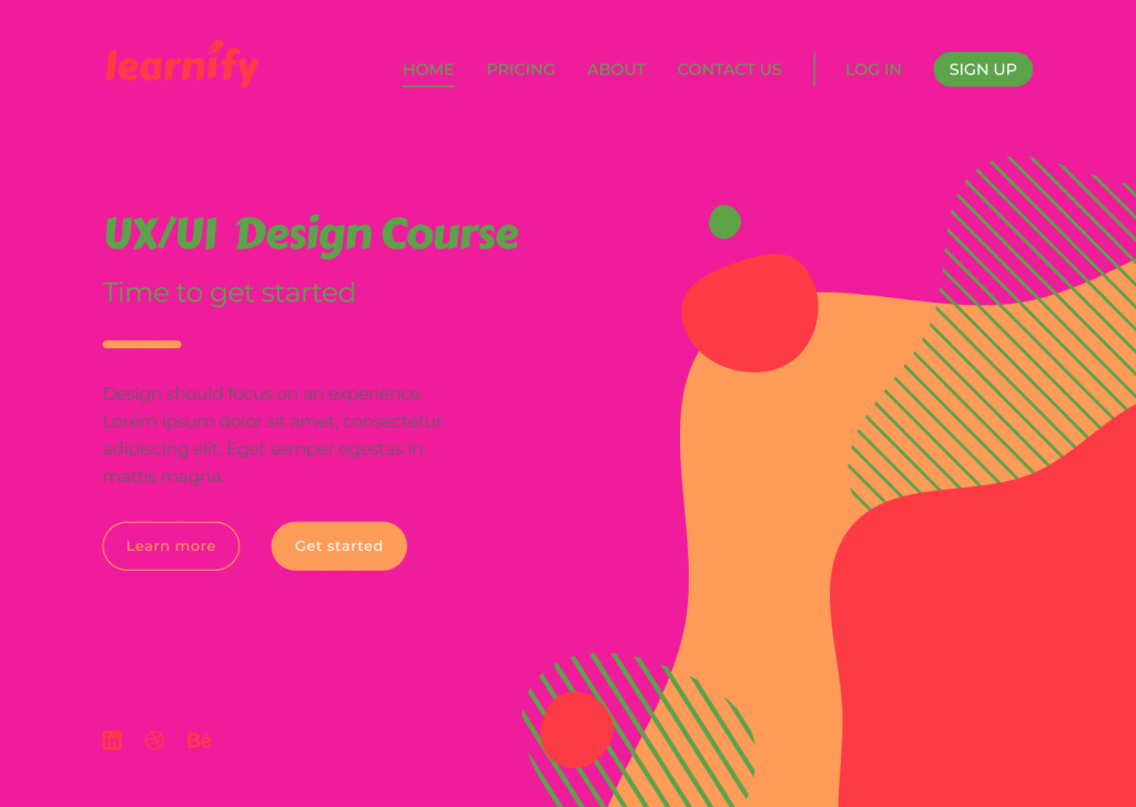
Colour
Users often perceive an aesthetically pleasing design as a more usable design, and they’re technically not wrong. More and more brutalist-inspired websites are receiving recognition among younger users. Their ruggedness and complete lack of usability is what makes them unique and memorable.
Sometimes the simplest, most intuitive, and most accessible user interface is not as popular as a modern design that has scarce consideration for usability. By and large though, if a website lacks aesthetics, it will most likely drive away visitors too.
Colour is another hugely important UI principle. Colour can establish the right tone, whether it acts as the main standalone component or is used as an oomph in other design elements. Colour can set boundaries, define shapes, and give emphasis to an area of a page.
In the example above, the colour selected for the design doesn’t reflect the brand nor enhances usability. The colour combination looks tacky and lacks contrast, creating difficulty when reading the page and identifying the navigation elements.
Tip
Apply the 60-30-10 rule. That’s 60% to the dominant colour, 30% to the secondary colour, and 10% to the accent colour. Consider using colour palette plugins, as these are predefined colour sets that can speed up the process of choosing the right colours for a design project.
Contrast
Contrast is the state of something being different from something else. For elements to contrast, there should be an evident difference between the two. Colour, scale, or a combination of both can be used to contrast two or more elements and create space.
RGB, hexadecimal, and HSL all have an impact on whether a colour will have enough contrast. The Web Content Accessibility Guidelines (WCAG) 2 – the international standard for designing for accessibility – is a good way you can learn more about the specifics. WCAG 2 expresses the brightness differences between colours in a form of a ratio, which ranges from 1:1 (e.g. white on white) to 21:1 (e.g. black on white). If we were to check the contrast of RGB values on white background, the ratios would look like this:
Red = 4:1
Green = 1.4:1
Blue = 8.6:1
(*the ration value will remain the same even if the text colour is reversed with background colour)
According to WCAG 2, the minimal requirement of the AA level of contrast ratio is 4.5:1, though this ratio requirement drops to 3:1 if a large-scale text is used. This requirement can be avoided altogether when referring to the contrast in decorative text and text in logos, as these do not affect the accessibility of an interface.
It is important to note that there are many colour hues and shades out there and the ratios cannot be rounded. If the colour contrast is 4.2:1, it automatically does not meet the minimal contrast requirement.
Below is an instance of how contrast should not be used:
The above design is an example of ineffective contrast use because the elements are difficult to read and identify. Lack of contrast strains the viewer’s eyes and can result in users experiencing frustration.
Tip
Using images as backgrounds can reduce text visibility. To make sure the text is adequately readable and meets WCAG 2 contrast requirements, use a coloured overlay on the image before placing the text on top.
Final thoughts
The different elements of a design should all work together as a team to tell a story and guide viewers through their user journey.
To all budding designers, I would strongly recommend familiarising yourself with UI principles before taking on a design project. The proper use of these principles will contribute to the flow and the outcome of your design, and significantly enhance the accessibility of the page.
Take a look at some of our previous campaigns to see how the design team at Verve Search have used design principles in their award-winning work.
Interested in our content marketing and digital PR services? Get in touch.
Campaign Spotlight – A Contact Lens Company Visual Content
My latest campaign spotlight focuses on three similar campaigns we produced for a contact lens company, all of which have been consistently covered by national and international lifestyle journalists.
These campaigns are Moving Perspectives, The Stroop Effect and Photographic Memory. I will discuss each campaign in turn, explaining the thought process behind their creation, and how their execution led to consistent coverage from top-tier publications.
The Stroop Effect was the first to launch in May this year. It is a colour perception game based on the Stroop test, a psychological phenomenon where the brain struggles to read the word of a colour when formatted with a different colour, for example Red written in green.
Based on this, we devised a test which measures how quickly you can identify five matching colours (e.g. Red, Pink, Green) against ten mismatching colours (e.g. Red, Pink, Green). We then tested the game on a survey with 2000 UK adults to give us various headlines about how well the nation performed.
To date, The Stroop Effect has been picked up 28 times with a total of 2,068 Link Score (Verve’s own tool using a combination of metrics to measure the value of links). The test also has over 100,000 views, thanks to features in the Mirror, Daily Mail, Mental Floss and Business Insider.
In July, we launched Photographic Memory, a game which tests the audience’s ability to spot details in ten images. They are given seven seconds to look at an image, then respond to a question about a detail in the photo.
We wanted to create a campaign which tests whether the user has a visual memory, as well as producing something with strong visuals that journalists could embed in an article. To add further credibility for journalists, we tested the game on 2000 UK adults to see how they performed. Just 1.2% of the respondents were able to get a perfect 10/10 score.
So far, Photographic Memory has 21 links from high authority news sites. It performed especially well with the UK tabloids, with the Sun, Daily Mail, Mirror, and Metro all covering the campaign within a few days of each other.
Our most recent campaign for a contact lens company launched on the 23rd August and has been the most successful of the three mentioned in this blog. Moving Perspectives takes optical illusions to a new level by showcasing seven mind-bending optical illusions made into moving GIF images.
We previously had success with In Perspective, a similar optical illusions piece with 11 illustrations of illusions which show the user how it tricks the brain into seeing something different. With Moving Perspectives, we explored this concept further by using dynamic illusions, which move to reveal how it works.
So far, Moving Perspectives has 41 links with a total of 2,103 Link Score. Again, this campaign proved popular with the UK tabloids including the Sun, Mirror and Daily Star all covering it. The campaign also received international coverage in Russia and Japan.
All three campaigns benefitted from quality designs which maximised the visual appeal of the campaigns and made them fun to interact with. The journalists we contacted appreciated the strong aesthetics in the three campaigns.
They also benefited from being embeddable on an article so readers can view them without having to leave the page. Moving Perspectives worked well in particular as the white background matched seamlessly with the page of an article.
As a result, the execution of these three campaigns has made it possible for us to build consistent links by appealing to lifestyle and pop-science journalists with similar content themes but a fresh idea which continues to attract coverage each time.
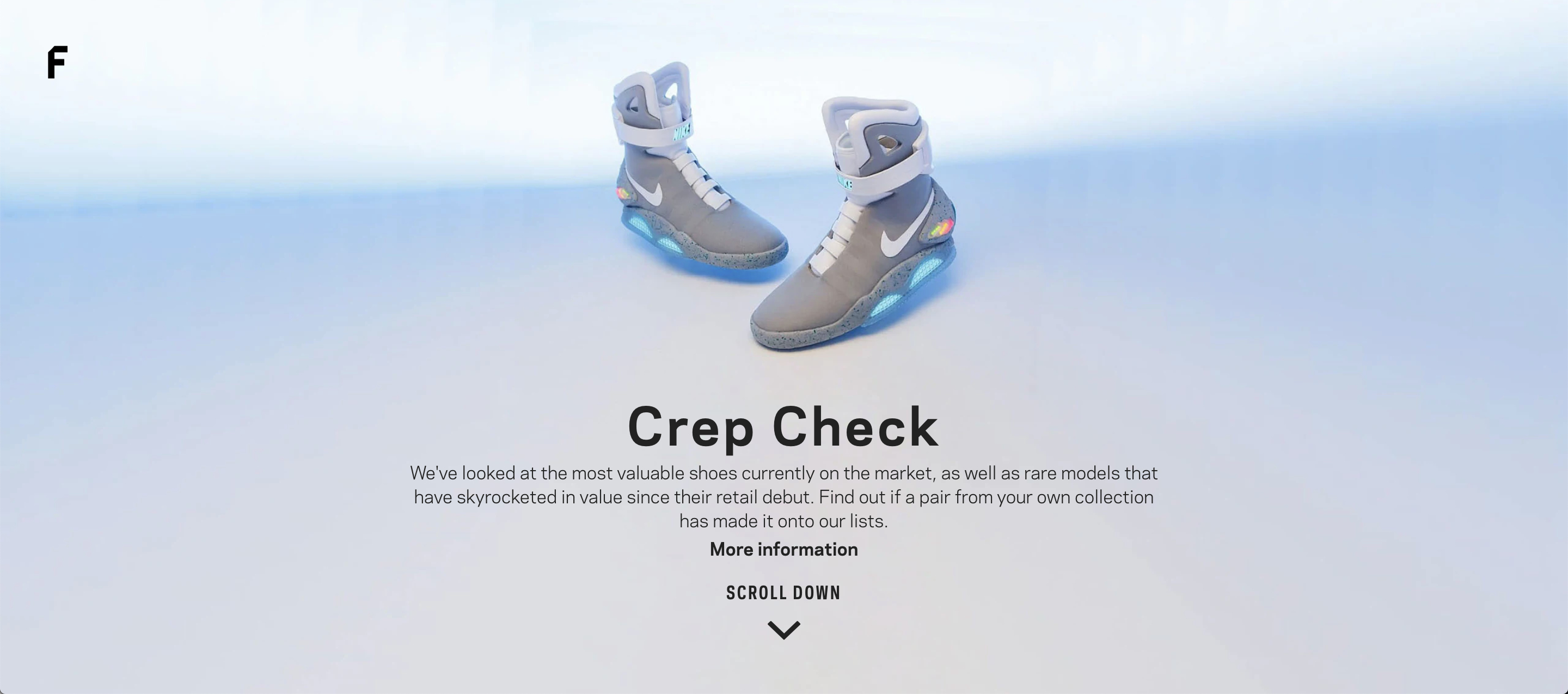
Campaign Spotlight – Crep Check
Starting this month, we will be sharing with you an example of a campaign which has delivered amazing results for a client over the course of the previous month.
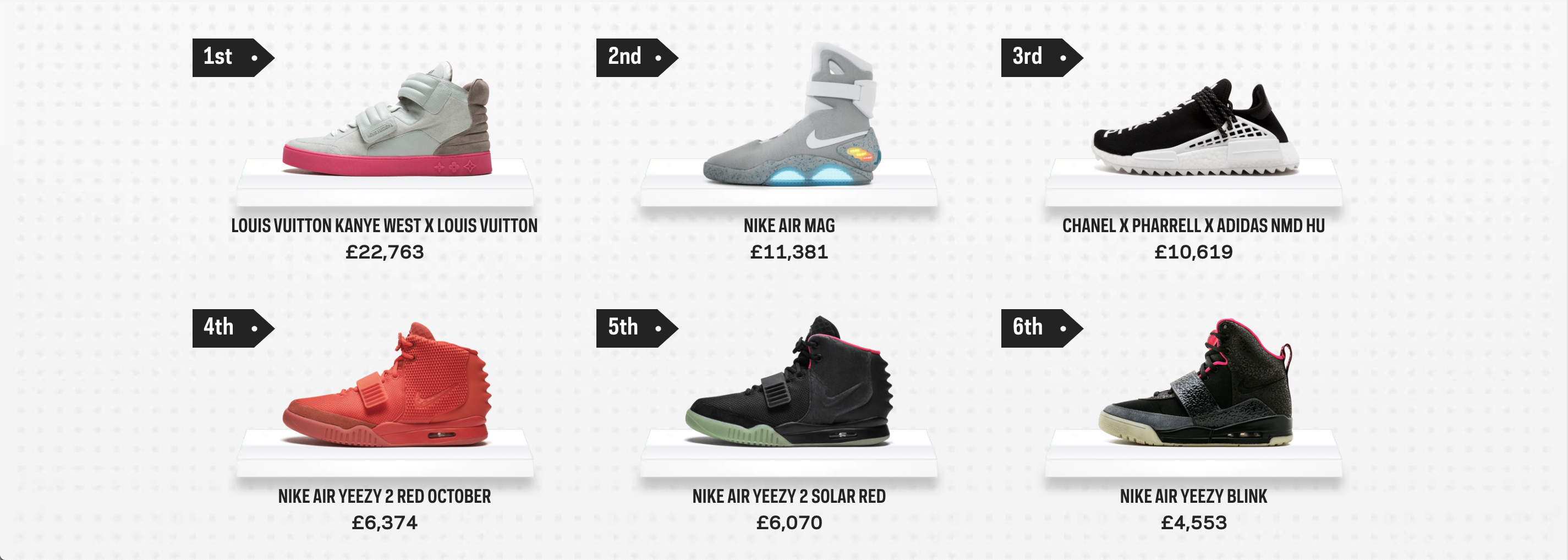
This month, we produced Crep Check for Farfetch, a luxury fashion retailer. The campaign looks at the most valuable trainers currently on the market, as well as those that have seen their value skyrocket since their initial release.
We teamed up with Stadium Goods to provide a definitive breakdown of the most valuable and appreciative trainers in modern times, and an explanation as to why so many of these shoes have become worth such vast sums of money.
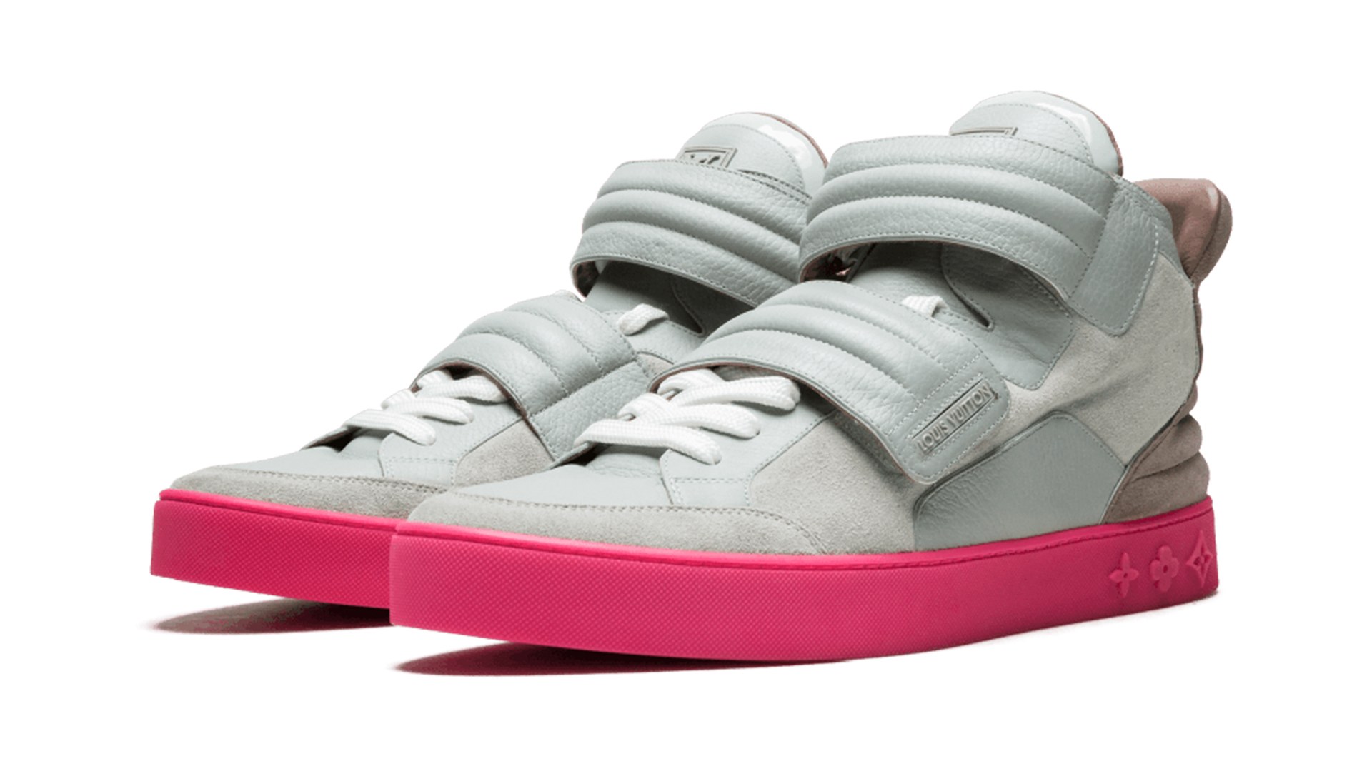
Costing £22,763, The high-top ‘Jasper’ sneaker from the Kanye West x Louis Vuitton line are the most valuable on the market. Released in 2009, the shoes designed by West himself have increased by more than 2500%. They were initially available in three colourways but the pink and grey version is the most coveted.
We found that Nike’s What the Dunk trainers had the biggest value increase. Released in 2007 at £91, they were designed as a patchwork of previous patterns, colours and materials used in old Nike SB models. Today, they are worth £3,793, an increase of over 4000%.
We took inspiration for the campaign from high-profile trainer auctions and one-off celebrity releases, which have been sold for tens of thousands of pounds. The international news interest these stories generate inspired us to create a definitive list using data provided by one of Farfetch’s key brands.
We also liked the idea of showcasing trainers as alternative investments, a concept we previously explored with coins and toy cars. Lifestyle, fashion, and money journalists love to follow the most recent collectable trends and valuations in fashion.
Our designs took inspiration from ‘sneaker walls’, similar to those found in Stadium Goods’ stores in New York and Los Angeles. We also used price tags to show the rank number, making the campaign feel more like a high-end fashion index. We then researched each shoe using Stadium Goods’ index to provide some context to their value increase.
‘Crep Check’ launched on the 26th June, and to date, our outreach team have delivered 98 links totalling 3367 LinkScore (Verve’s own tool using a combination of metrics to measure the value of links). We were also able to build links in seven different countries.
Our outreach coincided with an auction of the world’s rarest trainers in New York set up by Sotheby’s and Stadium Goods. This included one of the first-ever shoes made by Nike in 1972, which sold for £350,000. The interest in this auction meant journalists were receptive to a report about the subject to inform their story.
It also coincided with a PR storm involving Nike removing a limited-edition shoe from retail following complaints about the use of the ‘Betsy Ross’ flag, which has since been associated with white supremacy after its use as the original US flag.
Both stories helped us to get linked coverage for the client in Business Insider, CNBC, GQ, Houston Chronicle, Yahoo Finance, AD (Netherlands’ second-largest newspaper) and CNN’s Style section. In addition, the BBC’s Newsround team wrote an article about the world’s most valuable trainers using the campaign data.
Blog for business: 9 tips on how to write an effective blog post
Adding a blog to your business website is a brilliant way to connect with your consumers and also adds strength to your brand.
Many businesses haven’t latched on to the idea that a blog is a beneficial tool to use. Most believe a blog can be time-consuming; that thinking up ideas for posts and honing the quality isn’t worth the effort. We, at Verve Search, believe that’s utter rubbish.
A business blog for your website is not a waste of your time or website space. In fact, it’s one of the most cost-effective ways to promote your business which will inevitably lead to more sales, establish yourself as a leading authority in the industry, and give you a chance to broaden your market reach. Plus, it’s bloody easy to blog. Everyone’s doing it these days. I bet even your own mother is a blogger. Believe me, that’s no insult.
Here are some top tips on how to blog for business professionals.
1. Write for your consumers – they are your readers, after all
Writing a blog for your business is completely different to a personal blog. In other words, it is not about you (sadly). Your business blog is about your business and your customers.
Always remember that the people who are going to read your blog are consumers and potential consumers, so write for them. Your blog posts should aim to answer any possible questions they may have and deliver new insights into your industry.
2. Plan business for blog content in advance
Phrase one: “There simply isn’t the time!”
Phrase two: “I have no idea what to write about!”
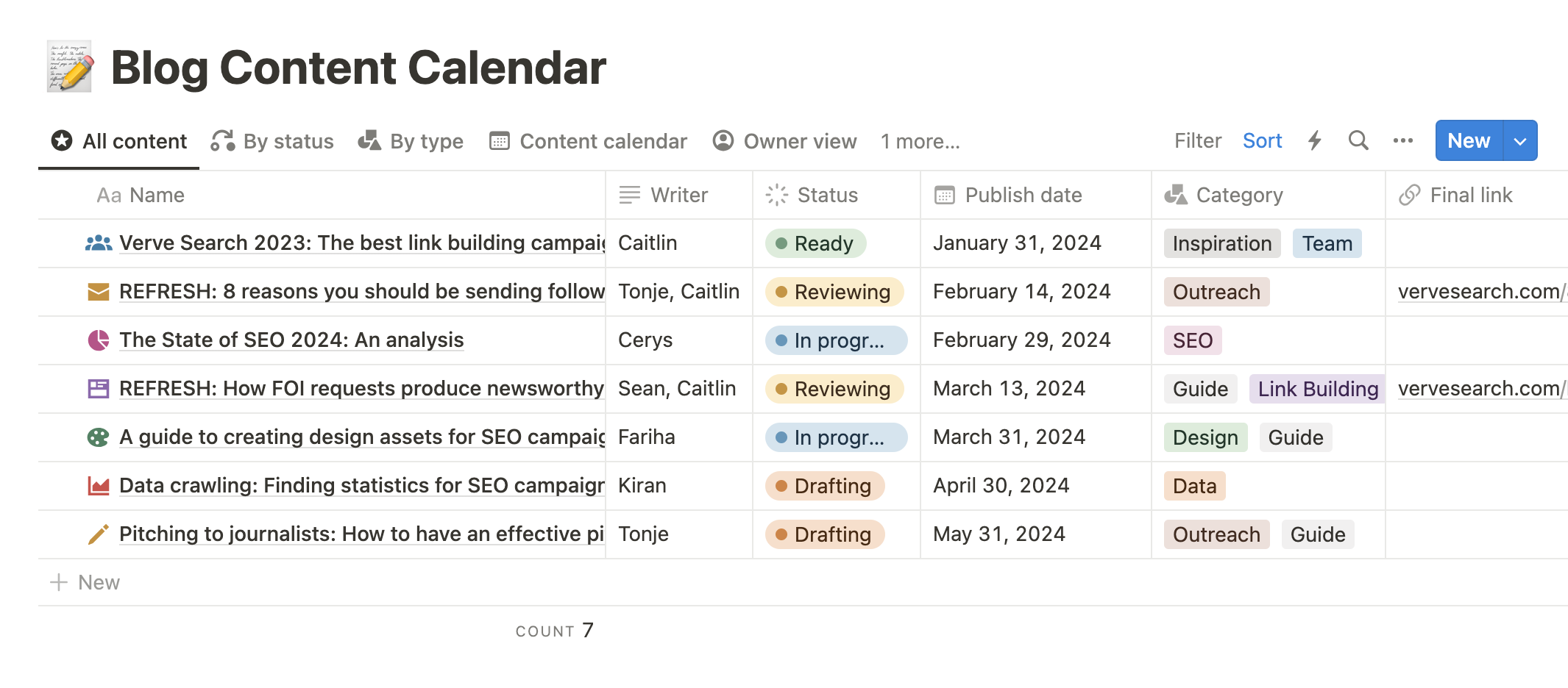
How many of you have used these two phrases as an excuse for not having a blog? Be honest. Well, brighten up lads and ladies for there is a solution: plan your blog posts. Lucky for you, we’ve attached an example of our content calendar below.
Every content calendar changes depending on your business needs and plans. Make sure to include a plan of title, who’s writing the piece, a proposed publish date and the categories you want this piece to sit in. These are all super important before you even start the drafting process.
This will solve any excuses for lack of time and ideas when the weekly calendar rolls around to blog-post-day (which should be around once a week by the way, more on that later). The benefits of mood boarding and brainstorming can take your blog that one step further. With a bit of planning at the start of each month, you can have enough ideas to keep the blog running for weeks.
3. Never underestimate the power of a good keyword
Overlooking the power of an SEO keyword is a big no-no. It impacts how a blog post is found in the search engine. The first thing a potential reader looks at is the title so you need a title that draws readers in and indicates what the post is about, whilst also including your keyword to be picked up by search engines.
Not sure what a ‘keyword’ is? Well, an SEO keyword is added to content online to make it optimized for a search engine. This means trailing the keyword throughout the content so that engines can pick up on what that content is about and rank it higher.
For example, notice how actionable the title of this blog post is indicating that you, the reader, will learn how to write a successful business blog. If I opted for a questioning title I could have gone for ‘Should You Add A Blog To Your Business Website?’ (The answer is ‘yes’ by the way).
4. Create constructive content on your blog for business
Providing your readers with valuable content is key to a successful business blog. It’s a way of establishing your business website as a leading authority in your industry. Writing about what you know is the easiest way to write.
For example, let’s say your business sells concrete countertops (yes, of course there are businesses for that!) which can admittedly be a dry subject but it’s your concrete business and you’re an expert on the subject. Write posts on the subject of choosing the right diamond pads for your concrete countertop, how fluctuating weather conditions can affect concrete, and what concrete countertops look like around the world. You can even veer away a bit and write something about how concrete is used in art projects. It’s all relevant and interesting content… as relevant and interesting as concrete can be.
Also, if you give readers posts that are informative and answer any questions they may have had on the subject they will reward you by becoming loyal consumers. Make your consumers see that you are the concrete solution to their concrete problem.
5. Blog little but often
Blog posts are not essays, so keep them short and sweet. People online are more likely to scan website content so it’s important to make every single word count.
If it takes you 1000 words or more to get a message across to your readers (just like this post) that’s absolutely fine. In terms of how often, the best practice is to blog at a consistency you believe you can maintain – once a week is good. Set a day to upload the post and stick to it. Search engines like new content and the more frequently you update your blog and website the higher your rankings.
6. Get the whole team involved
The blog shouldn’t be seen as one person’s sole responsibility. It’ll quickly become too overwhelming for that person and you’ll soon hear the two whining phrases outlined in point No.2. Give everyone a chance to write and share the responsibility of the blog. And when I say everyone I mean everyone from the CEO to the tea boy.
The best way to make this work is to draw up a blog rota every month. The different styles of writing and the voice that will emerge from your business will add more personality and ‘human’ depth. Plus, the more people you get to become bloggers, the bigger your pool of content ideas. Bonus.
7. Be inspired by your consumers
Remember that the consumers are your readers. Sometimes consumers have specific questions. Don’t just ask them in an FAQ section. Instead, answer the question by writing a post.
For example, your business sells concrete countertops (yes, seriously there are businesses out there that do that!) and consumers you’ve dealt with in the past wanted to know the ways to make their concrete countertops look more interesting. You can write a post outlining the options available to them from imbedding coloured glass to making a mosaic pattern, creating a marble effect or using glow-in-the-dark aggregate. Question answered.
Research what consumers are looking for by using the search engine. Look at search suggestions and related searches. Find keywords for your research. You can use a tool such as Google AdWords Keyword Tool to find keyword phrases that could turn into blog post titles which will drive more traffic to the blog.
8. Be visual
A simple technique to turn potential readers into actual readers is to provide images. Photos, graphs, infographics and videos have the power to communicate in a different, more instant, way than words. Images draw an audience in and provide an additional point of interest to your posts.
N.B. Do also make sure any images you use for your blog are either yours or Creative Commons images.
9. Analyse your blog for business performance
Use a web stats tool such as Google Analytics to measure your website’s performance. It’s free and is quick to install. You can use it to monitor how your blog’s performance is doing and get an idea of the ways people are finding your blog and what posts are the most popular. From all that information you can judge what’s been a success and how you can improve your future blog posts.
One dreary morning in January we decided that it would be a good idea to host a conference in the summer, you know, just to challenge ourselves a little. The next day the venue was booked.
A week later we’d got the branding sorted and had put up a page on the website. Now there are just a few days to go until outREACH, our first ever conference!
We are so humbled by the positive response we’ve had from brands, other agencies and freelancers, and we would like to thank everyone who has bought a ticket to support us. We cannot wait to meet you all on Friday!
As seasoned speakers, Lisa and Hannah knew exactly what was missing from the conference scene – a single track event 100% dedicated to outreaching content. Our event follows the whole process, with sessions on coming up with creative campaigns, how to get your ideas signed off, mindset, how to (and how not to) approach journalists, processes, tools, tips, and so much more. There is no other event like it in the SEO conference calendar.
We’ve hand-picked our speakers and the entire event has been planned around their specialist knowledge. You can see a full list of speakers on our agenda page here.
Jim will show you how to tame your tigers
Closing the conference is our keynote speaker, Mr Jim Lawless, with his tales on how he used the right mindset to ‘tame his tigers’ and become a jockey…oh, and also get in the record books.
outREACH takes place this Friday, 9th June, at the Congress Centre, 28 Great Russell Street, London WC1B 3EN.
If you would like to purchase a ticket (we have less than 15 remaining), click here and enter the promo code LASTCHANCE and you will be able to secure your ticket with a 30% discount off the ticket price.
We would really love to see you there!
How to Outreach Journalists in the Age of “Churnalism”
‘Churnalism is a form of journalism in which press releases, stories provided by news agencies, and other forms of pre-packaged material, instead of reported news, are used to create articles in newspapers and other news media.’
Churnalism is a reality for many editorial teams in 2017. They no longer have the luxury of spending hours writing lyrical longform tomes on a subject of their choosing. Instead they are expected to produce 5-10 pieces of highly shareable content a day that will keep readers, and advertisers, coming back to the site.
As a result journalists need to not only know what’s happening now, they also need to know what’s coming next. The pressure is on them to deliver something that stands out in the hyper-competitive wormhole of the content marketplace.
So how do we effectively deliver content to such a pressured, busy group of people? What are the myths that need dispelling and what methods can we detail to ensure that we are doing everything within our power to ensure coverage from these websites?
Give Them Everything
There’s a time and a place for suspense, but your outreach email isn’t it. You’re not Raymond Chandler, so include everything that a journalist needs to write an article in the first email.
The highest praise, and in many ways the ultimate goal, is to make it so that the journalist can practically copy and paste what you’ve said into their CMS, hit publish and move on to their next post.
The media landscape is geared towards one key factor: speed. If you can’t get there first, at least get there early. The early bird may get the worm but the second mouse gets the cheese.
By adapting your outreach to this mind-set and not making your email a riddle, you’ve already done 90% of the journalist’s job for them, increasing your chances of gaining coverage.
Follow Up Follow Up Follow Up!
Not wanting to sound too dramatic, but outreach can sometimes feel like you’re shouting into the void. Despite multiple subject lines, constant tinkering and casting a wide net – replies don’t always come as thick and fast as you’d like.
But don’t let the silence stall your motivation. As Roman philosopher Seneca said ‘luck is when preparation meets opportunity’. The opportunities for coverage don’t end after the first email. Put simply: follow-ups are fundamental, so make sure to keep communication up at your end.
I can count over a dozen recent instances where a journalist has enthusiastically covered a campaign without ever sending me back a reply. So firstly make sure to check to see if it’s been covered before you follow-up. As a start: search for the campaign (or set up alerts), check Majestic and monitor Google analytics. You may well find out about the coverage by reading about it online.
But when do you stop? I tend to keep it to two maximum, after all, they may well not be replying because the campaign isn’t good enough, it’s not their beat, or what you’ve written hasn’t sold it to them. But it’s important to let them make that decision themselves, and by stopping at the first hurdle, you’re making it for them.
Multiple People Same Publication
Don’t be afraid to email the same piece of content to multiple journalists at the same publication.
Yes, it’s important to keep emails personalised, but as we have already established, journalists are very busy people, and they understand that you need to cast a wide net to get the coverage. They’re not going to take it personally, simply because they don’t have the time.
It’s not worth only sending an email to an editor in the hope they will delegate it to a writer, or just sending it to a writer in the hope they will pitch it to their editor. It’s not a two birds one stone scenario – you want to hit as many birds with as many stones and, repeatedly, when necessary.
Ultimately it’s worth remembering that in 2017 you are not only competing with the swathes of other link-builders, outreach people and PR professionals, but also with the journalist’s time. If you respect that, and adapt to their reality instead of trying to force your own, you will have a lot more success, and potentially make some reliable contacts for the future.
Want to know more? We are hosting our very own conference 100% dedicated to outreach! Click the outREACH Conference logo for more information.


 Churnalism is a reality for many editorial teams in 2017. They no longer have the luxury of spending hours writing lyrical longform tomes on a subject of their choosing. Instead they are expected to produce 5-10 pieces of highly shareable content a day that will keep readers, and advertisers, coming back to the site.
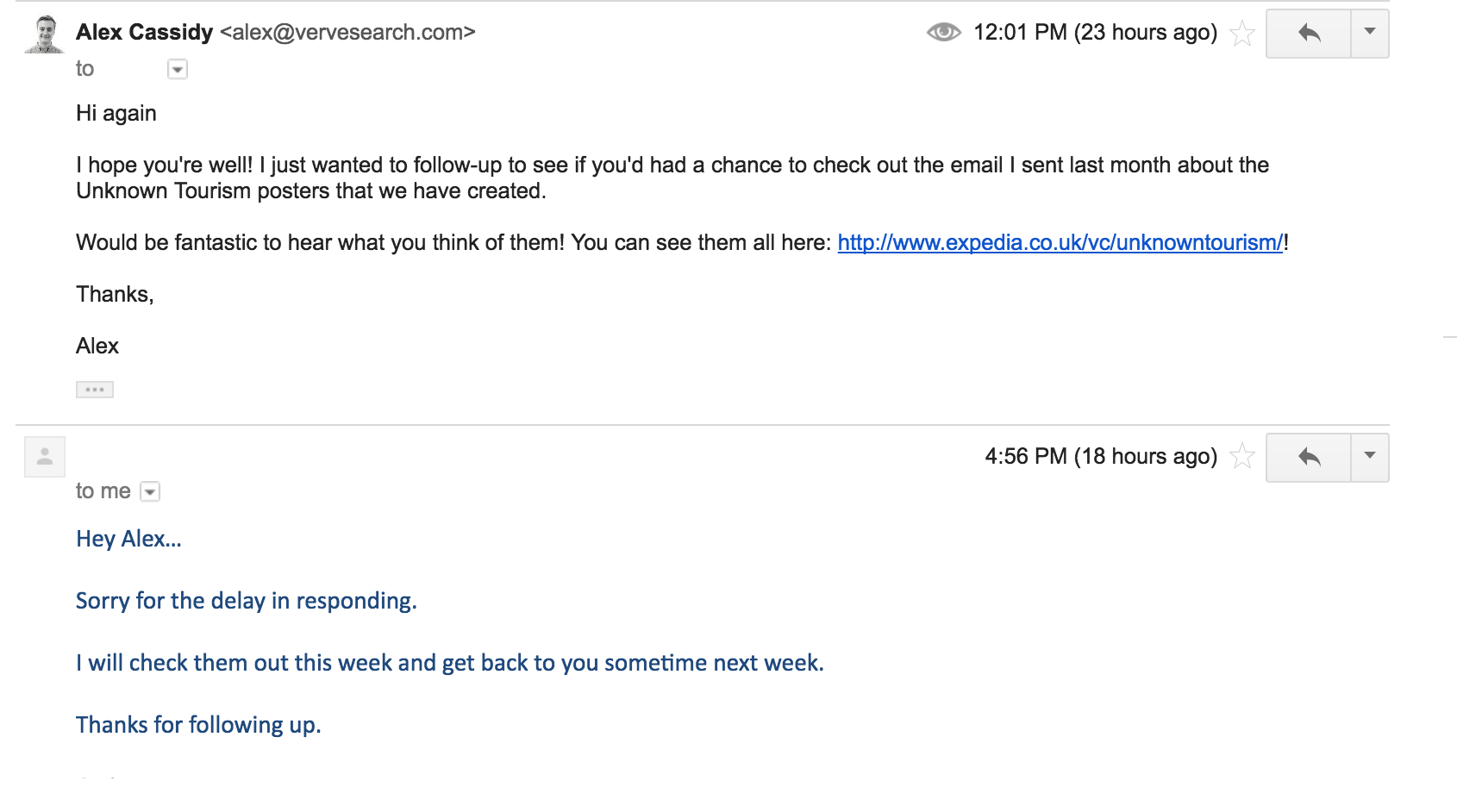 I can count over a dozen recent instances where a journalist has enthusiastically covered a campaign without ever sending me back a reply. So firstly make sure to check to see if it’s been covered before you follow-up. As a start: search for the campaign (or set up alerts), check Majestic and monitor Google analytics. You may well find out about the coverage by reading about it online.
 Ultimately it’s worth remembering that in 2017 you are not only competing with the swathes of other link-builders, outreach people and PR professionals, but also with the journalist’s time. If you respect that, and adapt to their reality instead of trying to force your own, you will have a lot more success, and potentially make some reliable contacts for the future.